EvolveWare + Intellisys
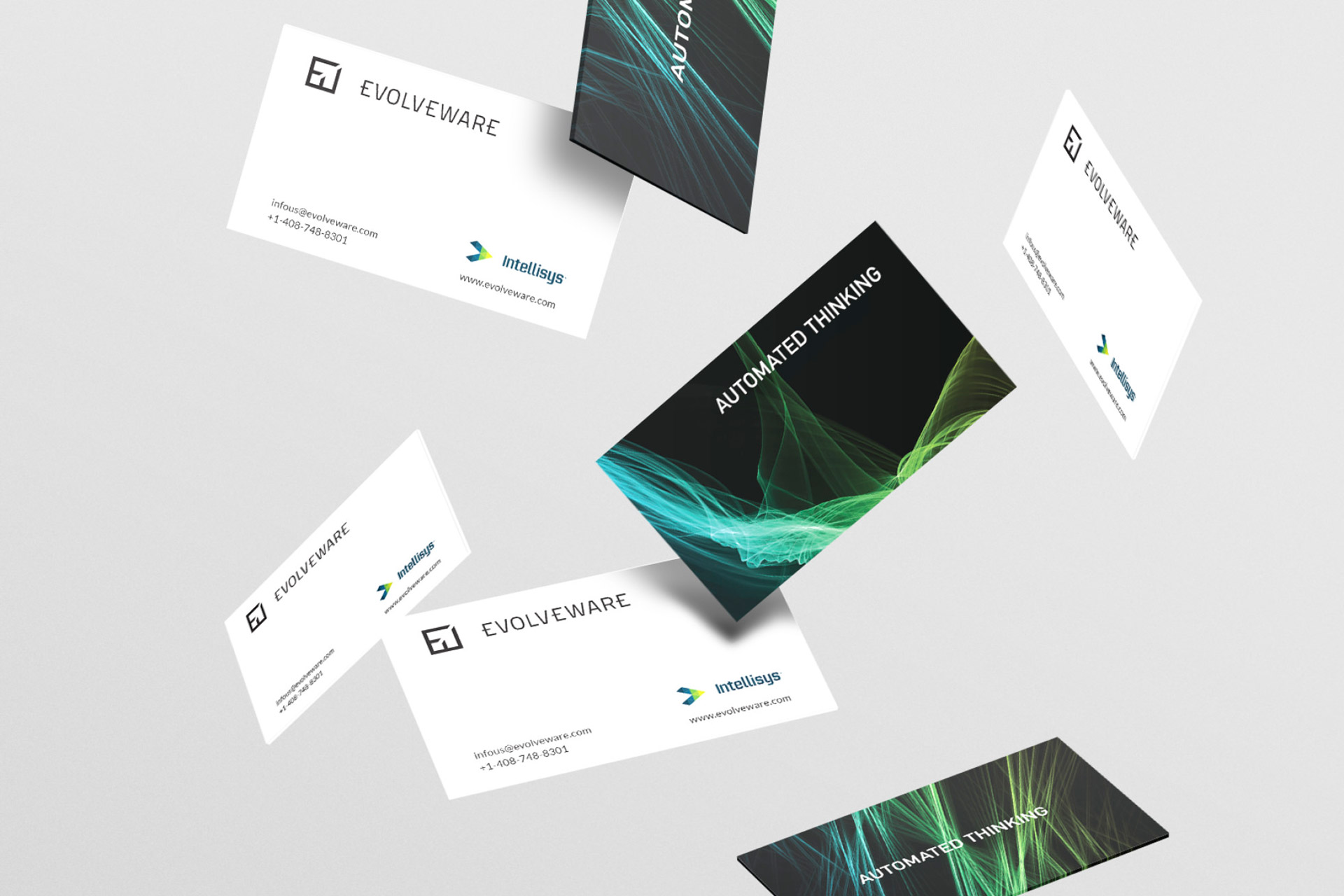
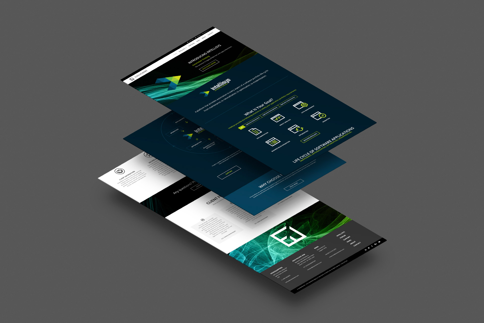
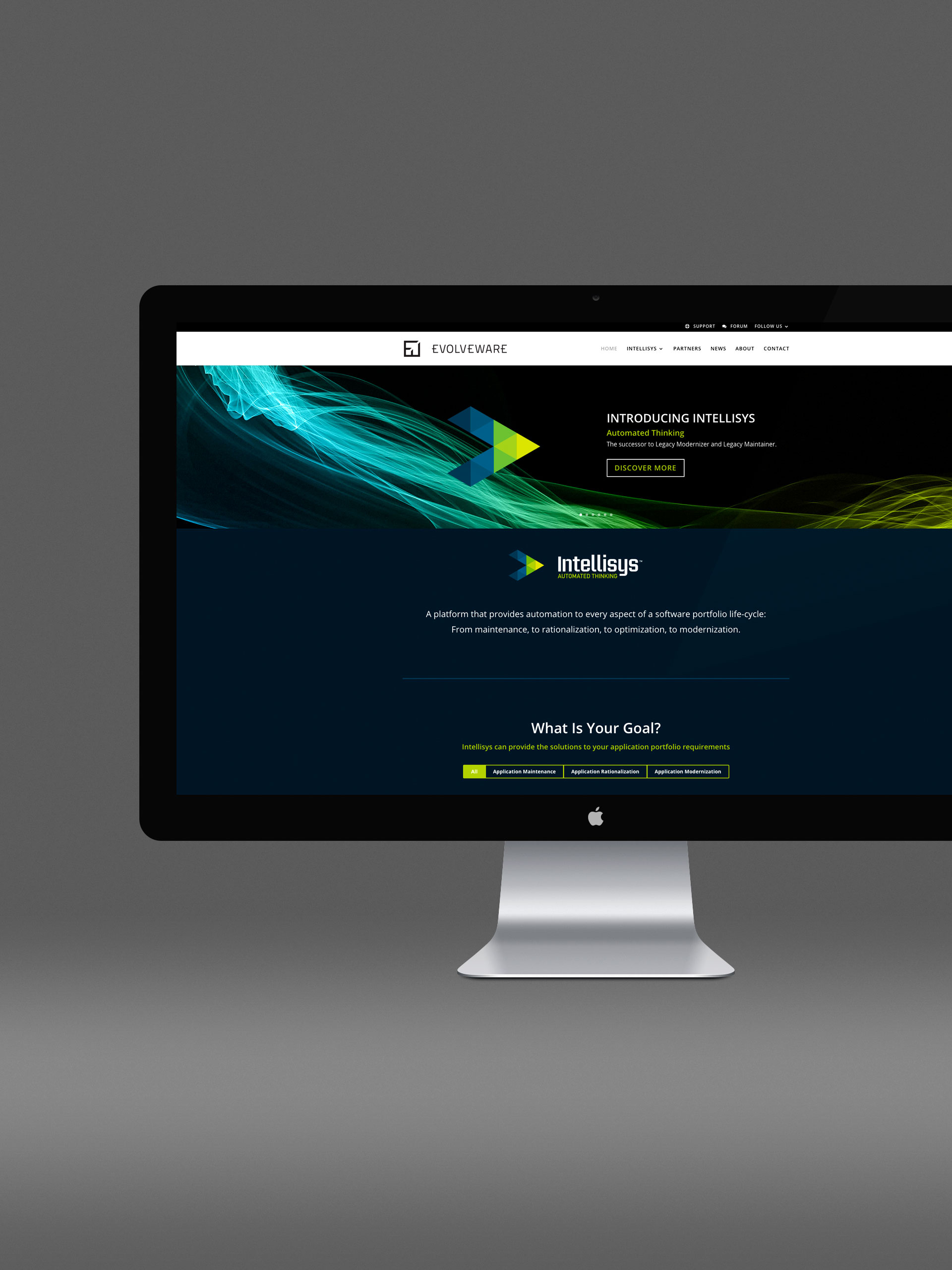
California-based software vendor Evolveware has clients ranging from federal and state government agencies to financial and insurance companies. Founded in 2001, they have been providing customers with solutions to automate the management of multiple software applications for many years. In 2017 they launched a ground-breaking new platform, Intellisys, a system to substantially increase productivity and ensure IT operations run more reliably and cost-effectively. Not only did they require branding for the parent company, but also the sub-brand, and give consideration, too, to the brand architecture as a whole, allowing for further brands to be added in the future. Given the company’s history as a greatly respected presence in the field, it was clear very early on that a modern wordmark would be ideal for Evolveware, and in turn Intellisys too. Wordmarks are excellent in cases where the company is well-established and easily recognisable. Taking the E from ‘evolve’ and the W from ‘ware’, we created a clean and angular graphic to accompany the brand name in its complimentary typeface. Similarly for Intellisys, a clear, modern, technical typeface was used, along with a forward-pointing graphic which perfectly summarises the systems at the heart of the business. Having noticed a distinct lack of colour in the landscape, we decided to buck that trend with some intense blues and greens, which are hugely impactful and eye-catching while remaining authoritative and professional. The smart colourways segue well from print to web and back again, adding pops of colour which give variety to the content and have an appealing aesthetic. It’s a fine line between creating an identity with gravity and weight, integral qualities of the Evolveware group, but which are interesting and attractive and also enduring. Five years into the project we’re happy we’ve both achieved and exceeded this challenge.
Branding
Design
Print
Website
Design
Website


