Global Biodata Coalition
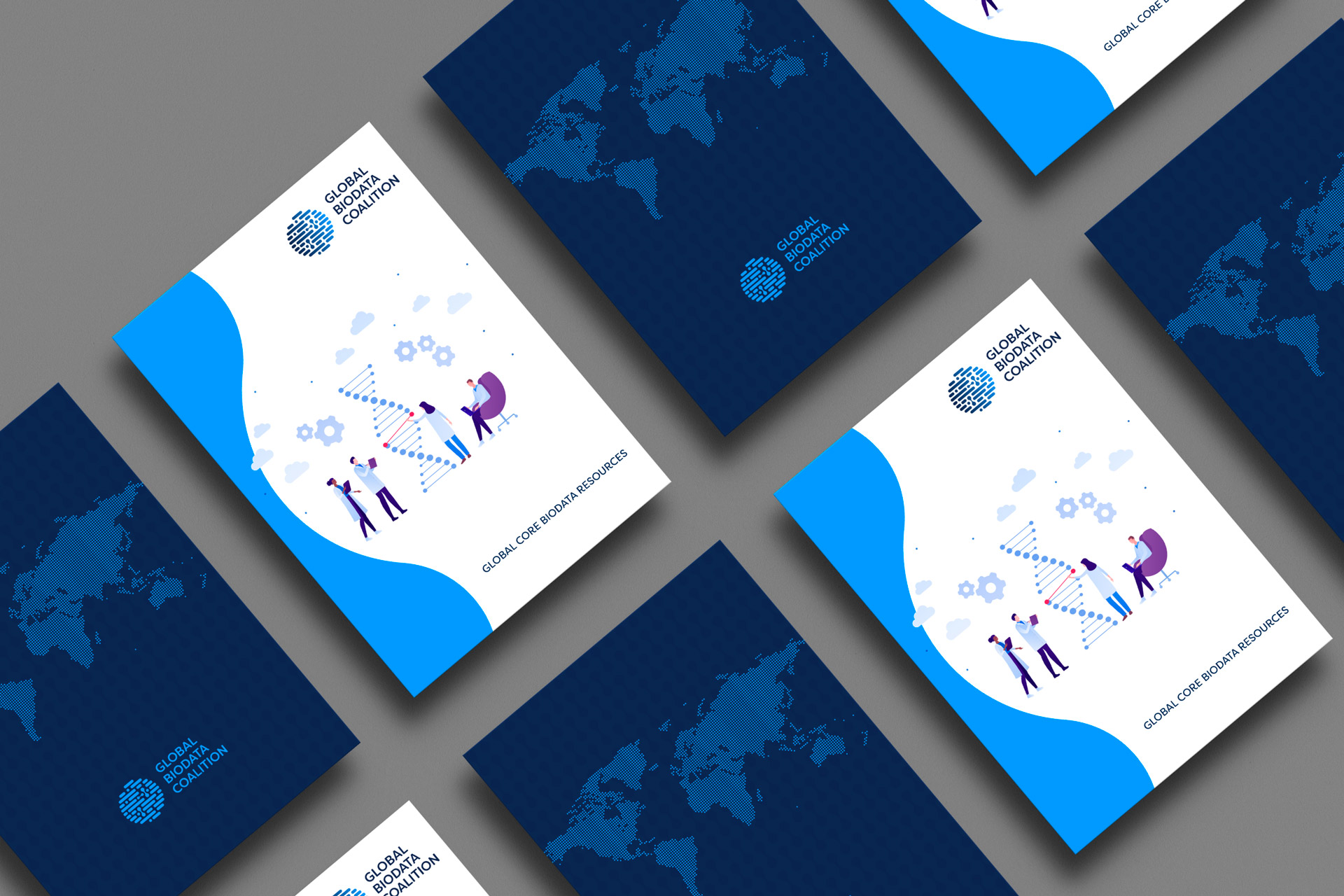
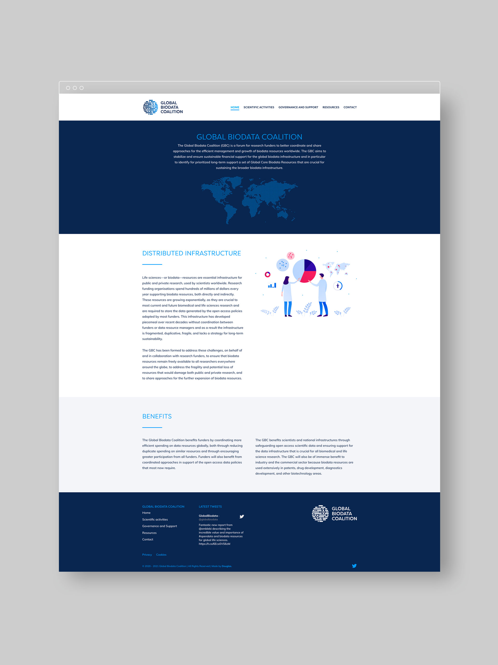
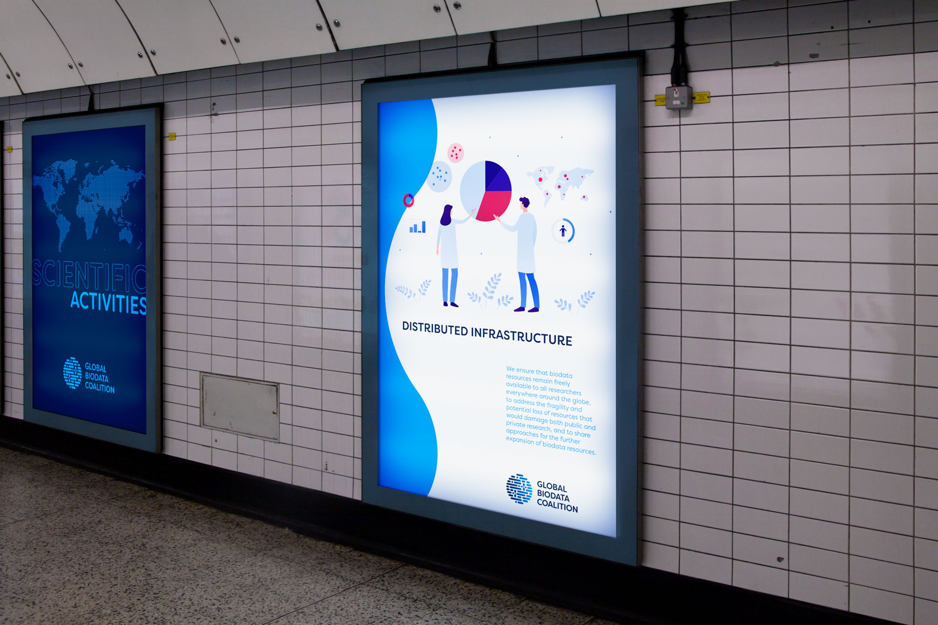
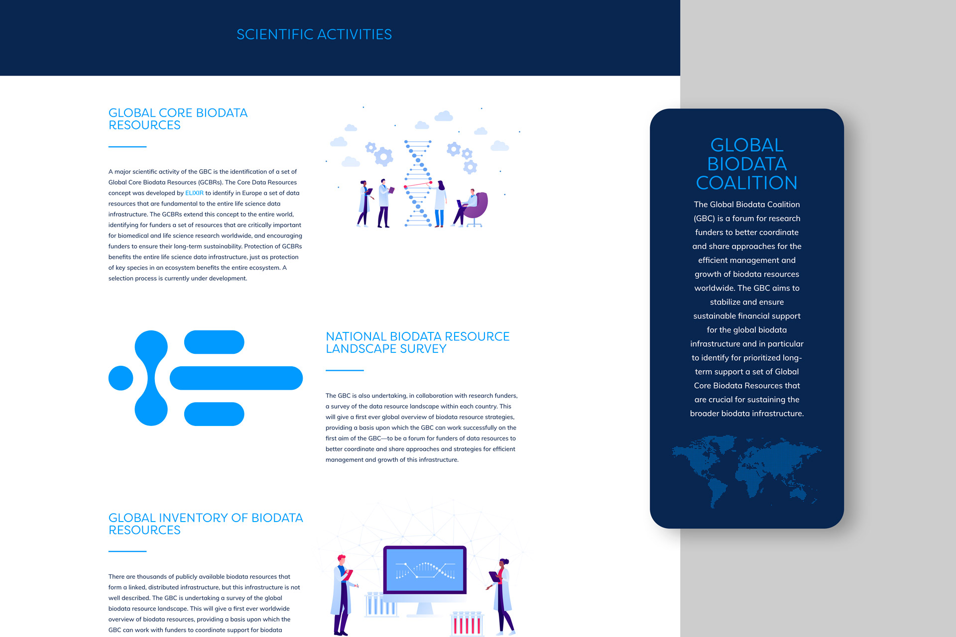
The Global Biodata Coalition was such an interesting proposition to work on. As a centralised hub for research funders in the life-sciences—or biodata—arenas to come together, it needed an identity which would reflect a forum truly global in its scope. It also needed to be suggestive of the nature of life sciences and themes of connectivity, as well instil a sense of accessibility and trust. The resulting logo is globe-like in shape, made up of different but interlinking ‘cells’ and accompanied by a wordmark which is both crisp and clear but with a subtle softness, resulting in a happy marriage of imagery and typography. The portfolio is predominantly made up of authoritative blues and clean whites, with gradient used for effect. Maps were designed using dot symmetry, inferring a bringing together of minds and resources from all over the world, while eye-catching and appropriately used illustrations support this idea further.
Branding
Design
Print
Website
Design
Website
