mymediset
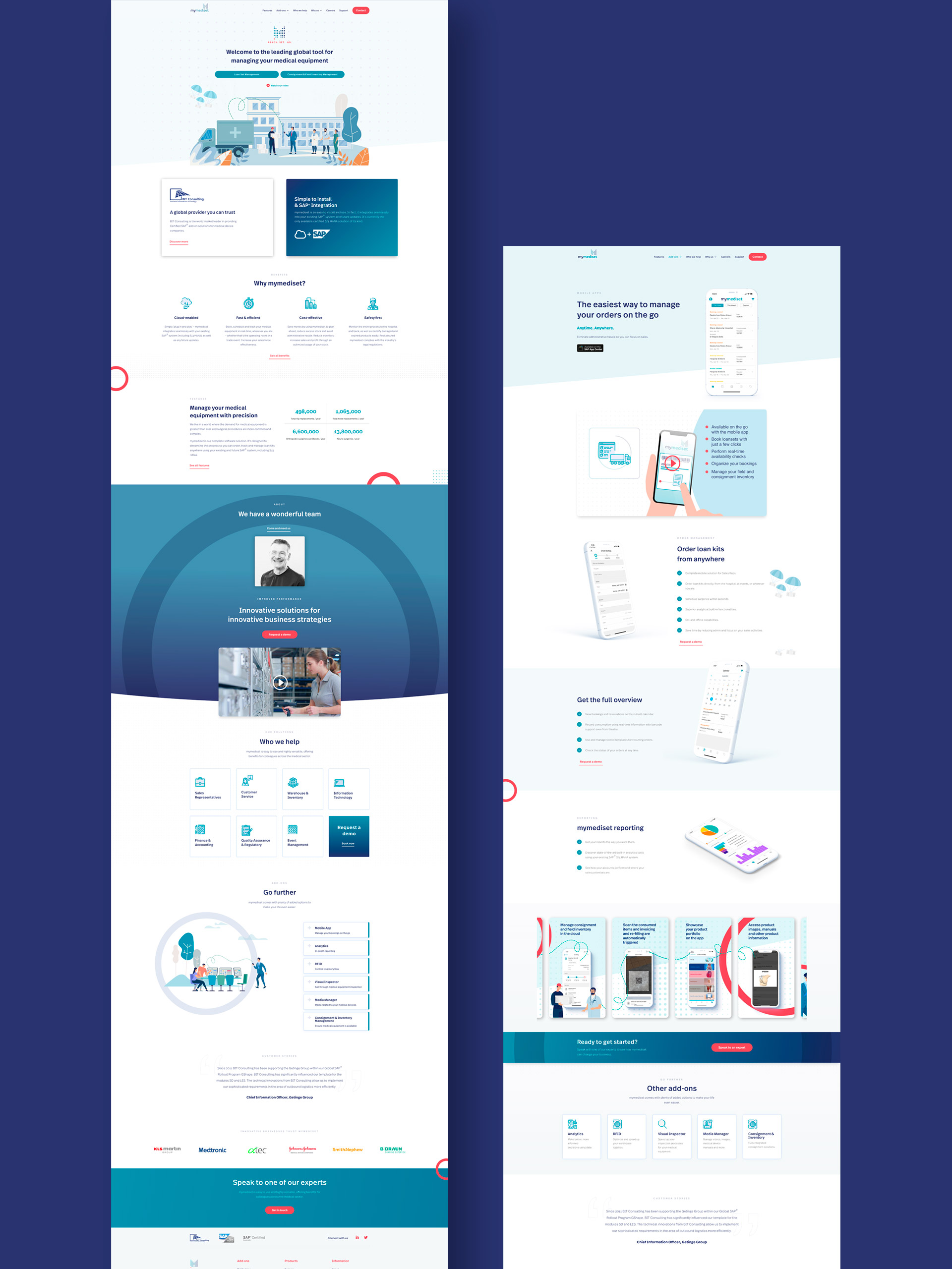
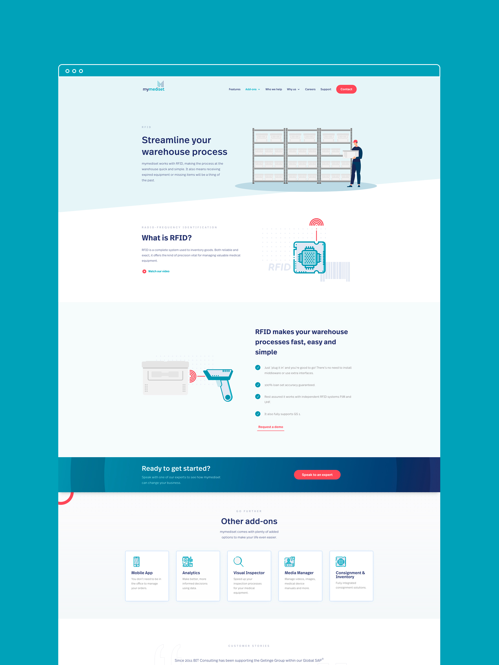
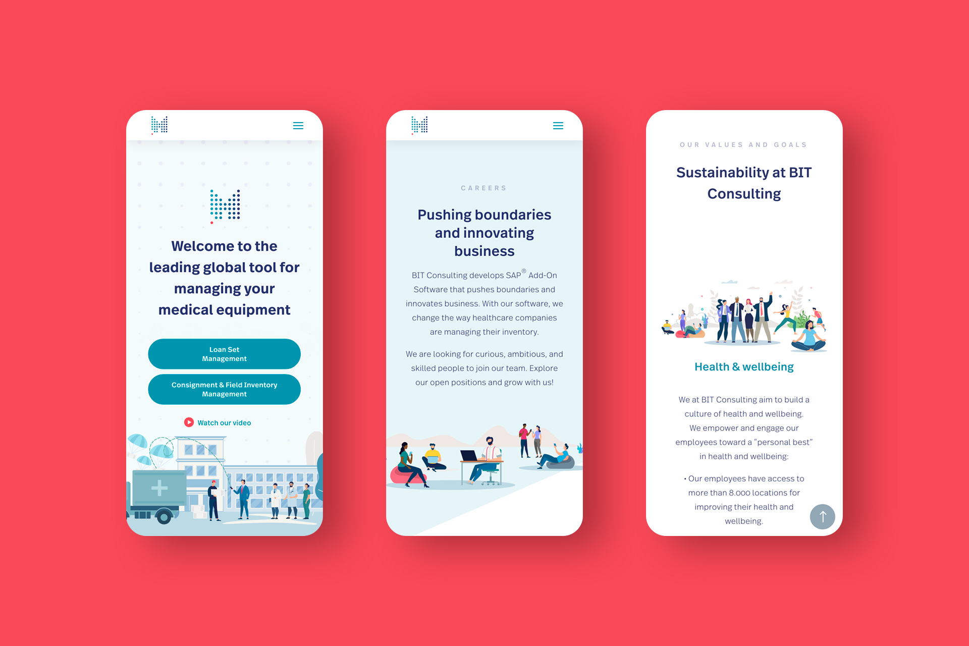
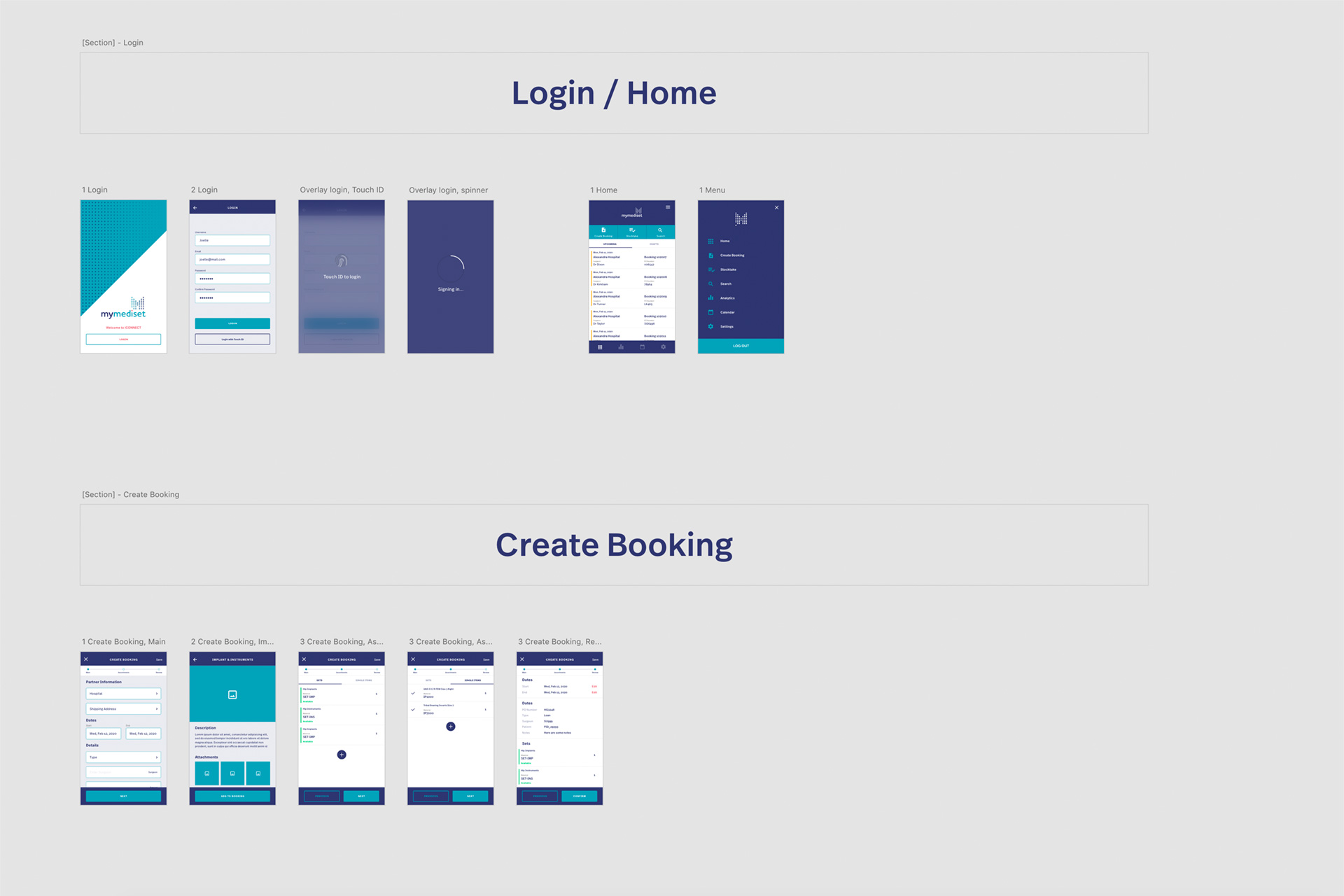
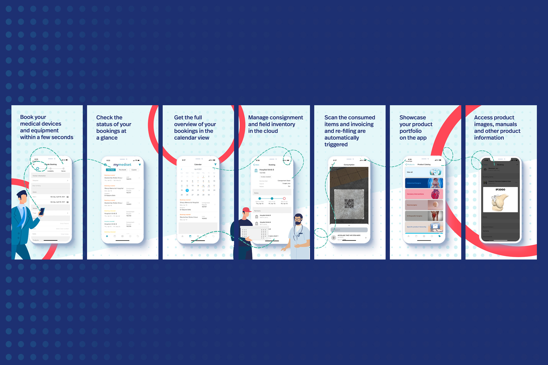
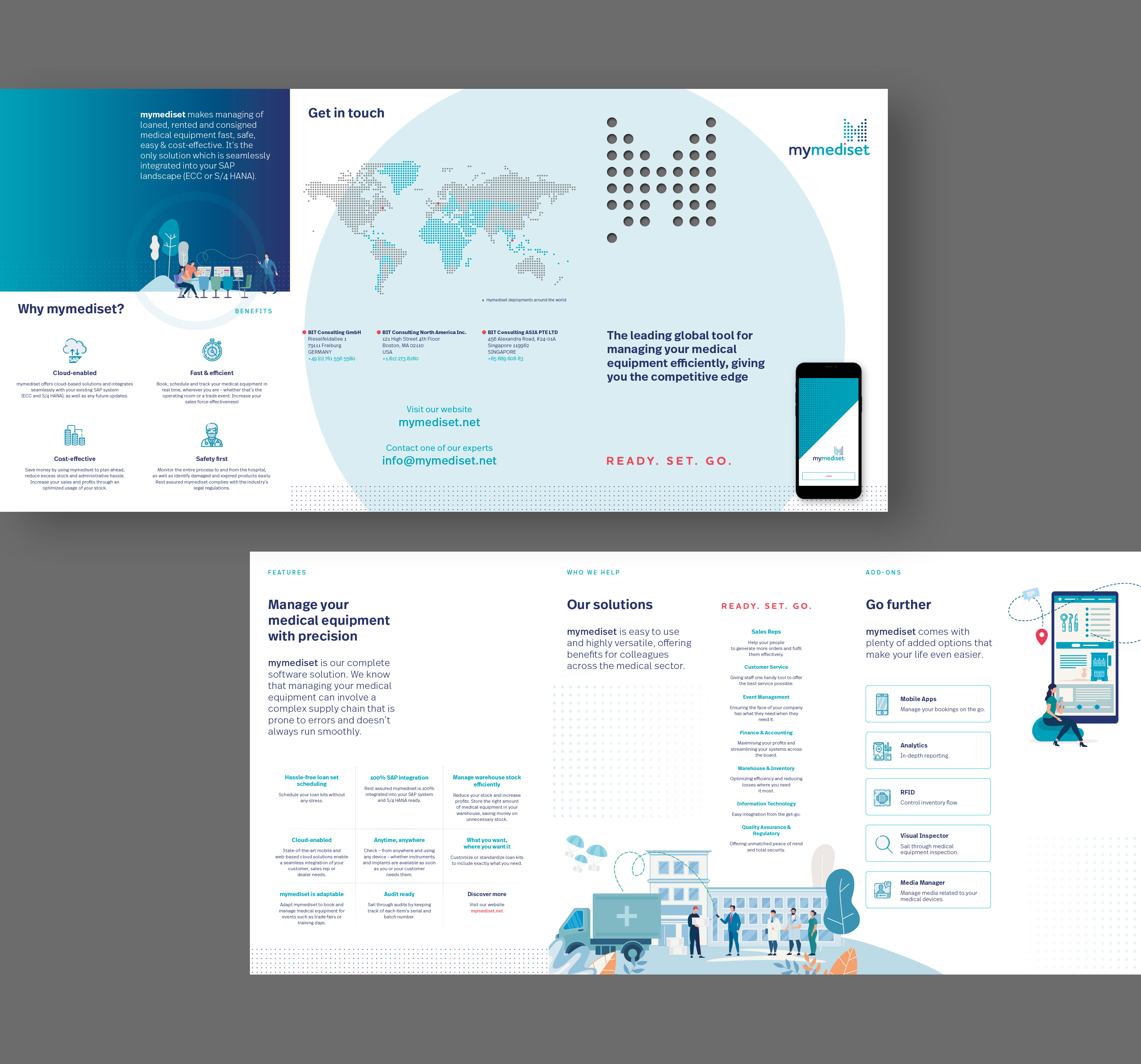
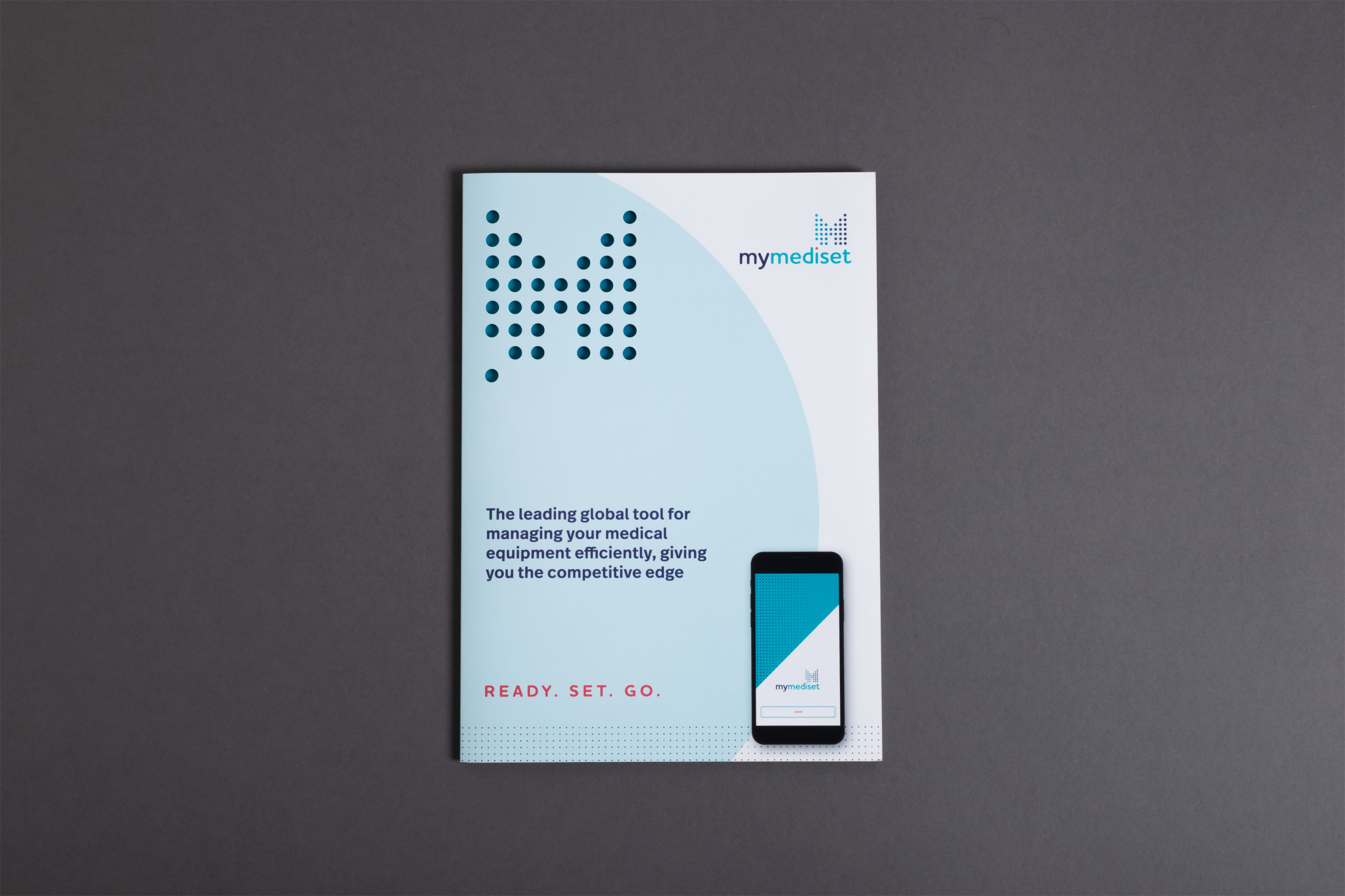
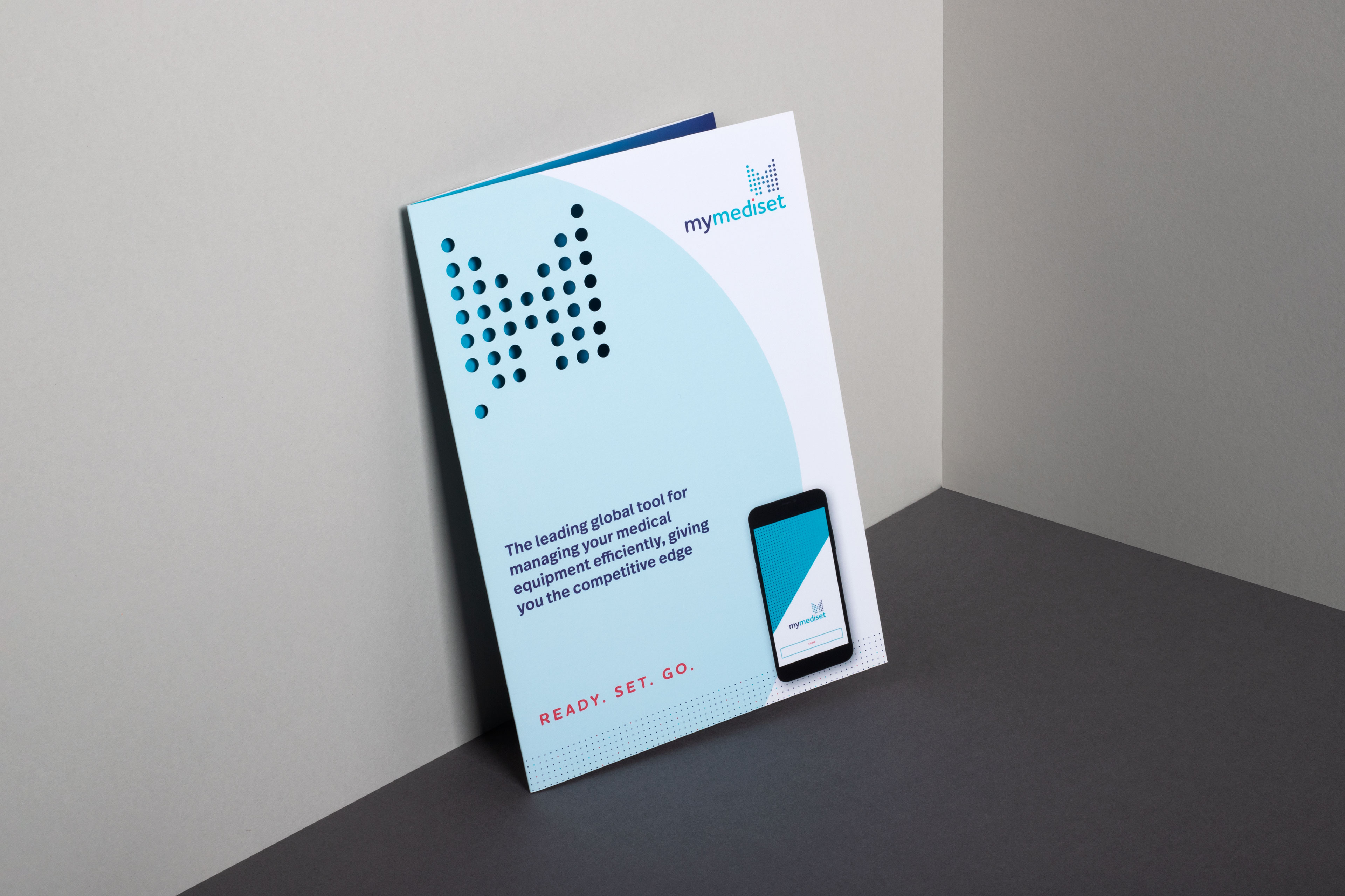
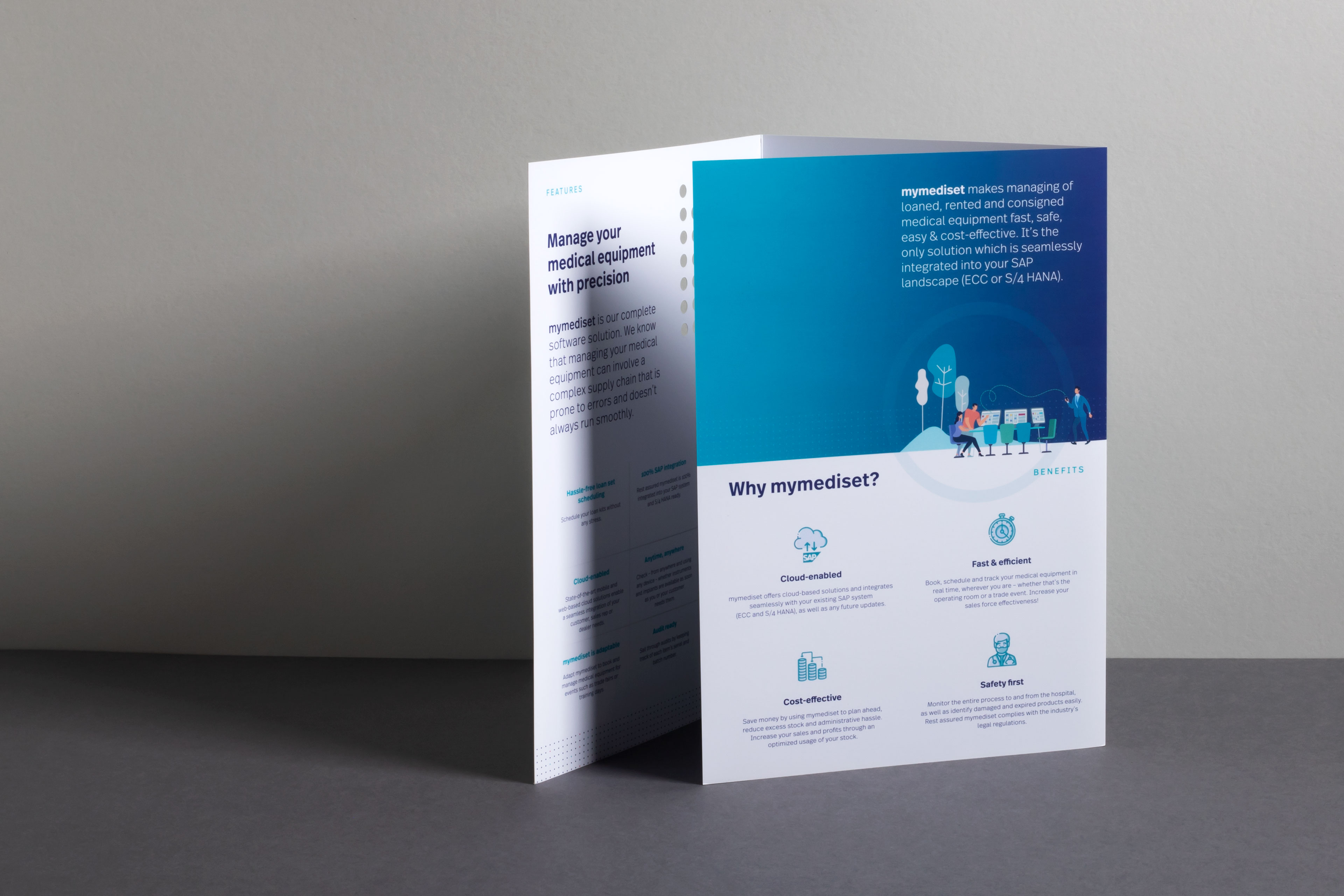
BIT Consulting came to us in the latter part of 2019 with a brief to create a new identity for their product mymediset. This was to include everything from a new logo and tagline, to copywriting, stationery and brochures, as well as a complete web design and build. Later an app design too. As creators of the leading global tool for tracking medical equipment, mymediset needed an identity which would reflect their forward-thinking technology and evoke a sense of order, trust and connectivity. Out of this came the idea of the M dot grid which went through a number of permutations before the final design you see below. Providing the technology for hospitals to track medical loan sets, mymediset needed a design which would bring together the concepts of efficiency, order, and ultimately the movement of surgical sets. The animated build of the M grid does this perfectly, in blues which conjure a sense of confidence and stability, offset by a mobile red dot to highlight the idea of movement, in the colour most often associated with the medical profession. All of this is underlined by a tagline we felt summed up the mymediset product clearly and concisely, using the familiar wording – Ready. Set. Go.
Branding
Design
Copywriting
Print
Website
Design
Copywriting
Website
To support the visual devices, we’ve used FF Real Text as our typeface of choice, a lettering style known for professionalism and reliability and one which has a nice tie to the company, both being German by origin. Designed by Erik Spiekermann, the German typographer and designer, FF Real is a re-interpretation of the German grotesque style, but with much more warmth and improved legibility. With a hint towards the warmer American grotesques we also felt it was well-suited to the US market the company is making rapid headway into.
