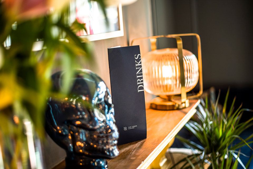
The Lodge Duxford
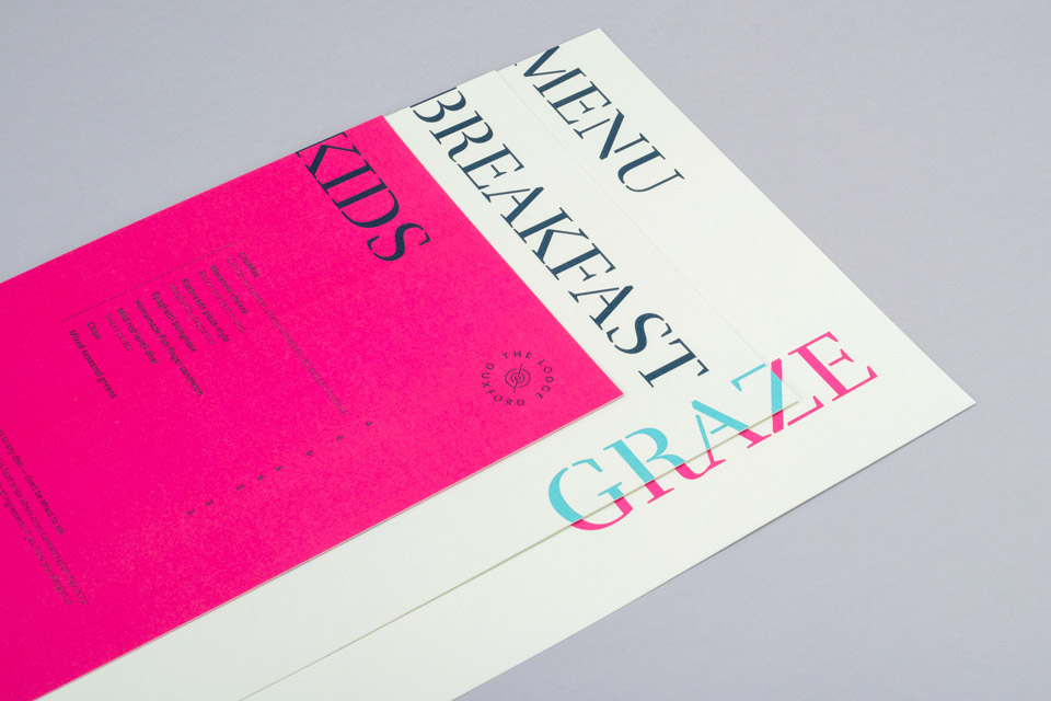
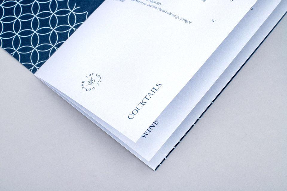
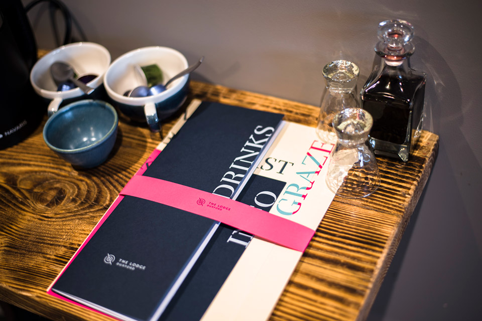
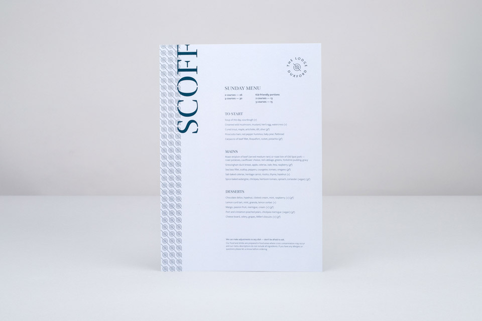
We had the pleasure of working on all aspects of the launch branding for The Lodge Duxford, from design, print and web, to typography, signage and copywriting. You’ll see throughout the cohesive visual identity a number of strong themes. The use of colour was carefully considered, predominantly a rich blue and grey to match the walls of TLD’s interior, while pink and blue pops add contrast and accents, much as they do within the building. Typography across the portfolio was also thoughtfully and creatively used. A number of stencilled styles hark back to war poster designs, closely affiliated with the Duxford area, while the modern brushstroke style adds a more playful dynamic, mirroring the artwork and accessories seen throughout the hotel. Ditto patterns that can also be seen in the interior parquet and tiling — offering synergies wherever possible.
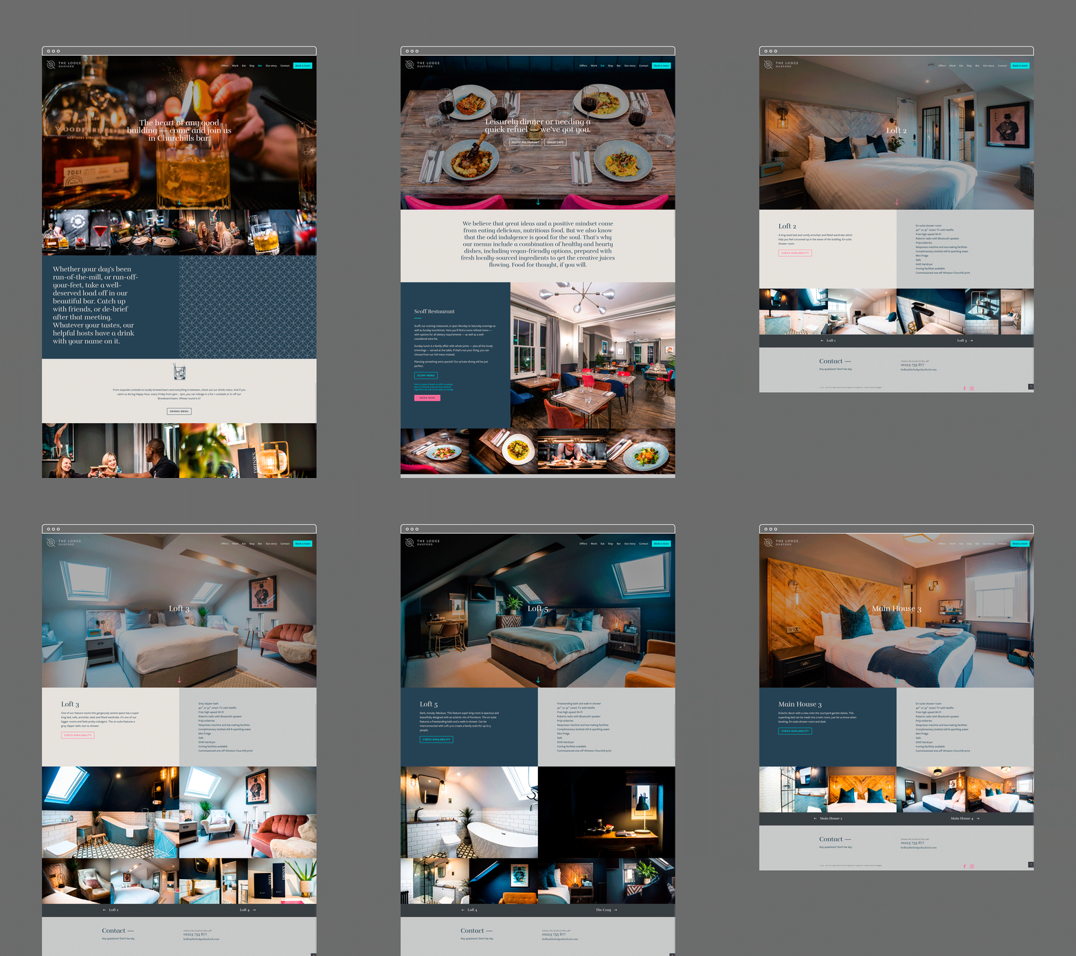
A major showcase for TLD, and often the first touch point for any prospective guest, is the beautifully-bespoke and information-rich website. As you can see, we’ve celebrated the eye-catching exterior to welcome you in, with hero shots aplenty across the rest of the site. Dedicated pages for co-work spaces, eating areas and rooms follow, with booking capabilities too. Colour palettes, patterns and other imagery compliment TLD’s branding and provide a cohesive and inviting look, suitably reflective of this stunning hotel, social space and work hub.
Branding
Copywriting
Design
Print
Website
Signage
Copywriting
Design
Website
Signage
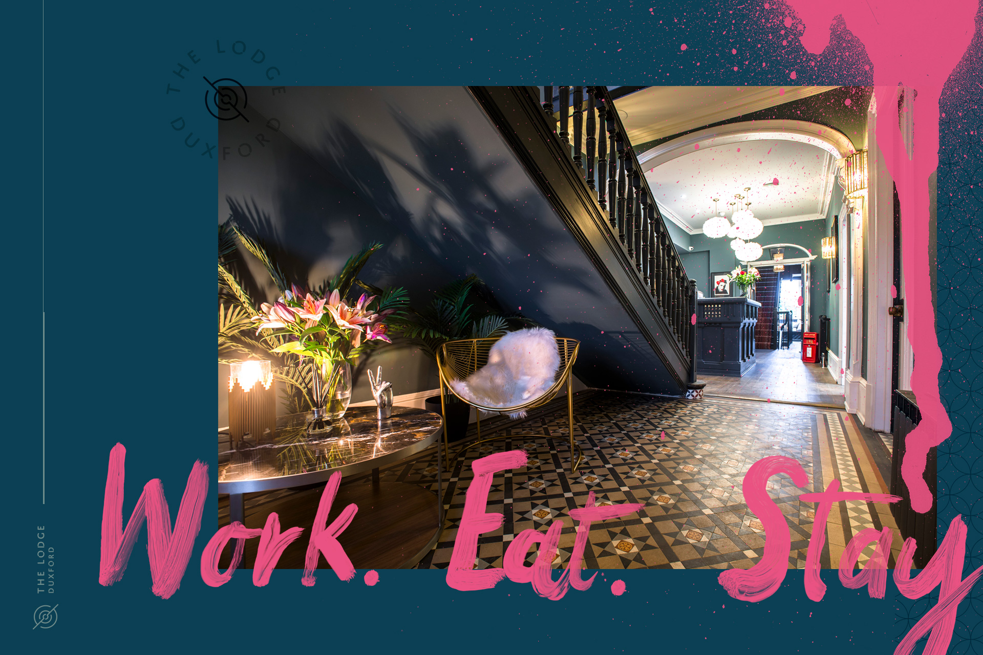
Sophisticated devices, colour palettes, logos and patterns run throughout the site. Peppered with eye-popping pink and blue illustrations, a sumptuous darker blue and grown-up grey also feature heavily, to offer a balanced background for fluid copy and beautifully-rendered photography. Clean lines, spray paint, warm tones, neon — just some of the juxtaposed elements that sum up TLD’s universal appeal and their individual take on the boutique hotel industry — taking us on an attractive journey through easily navigable pages.
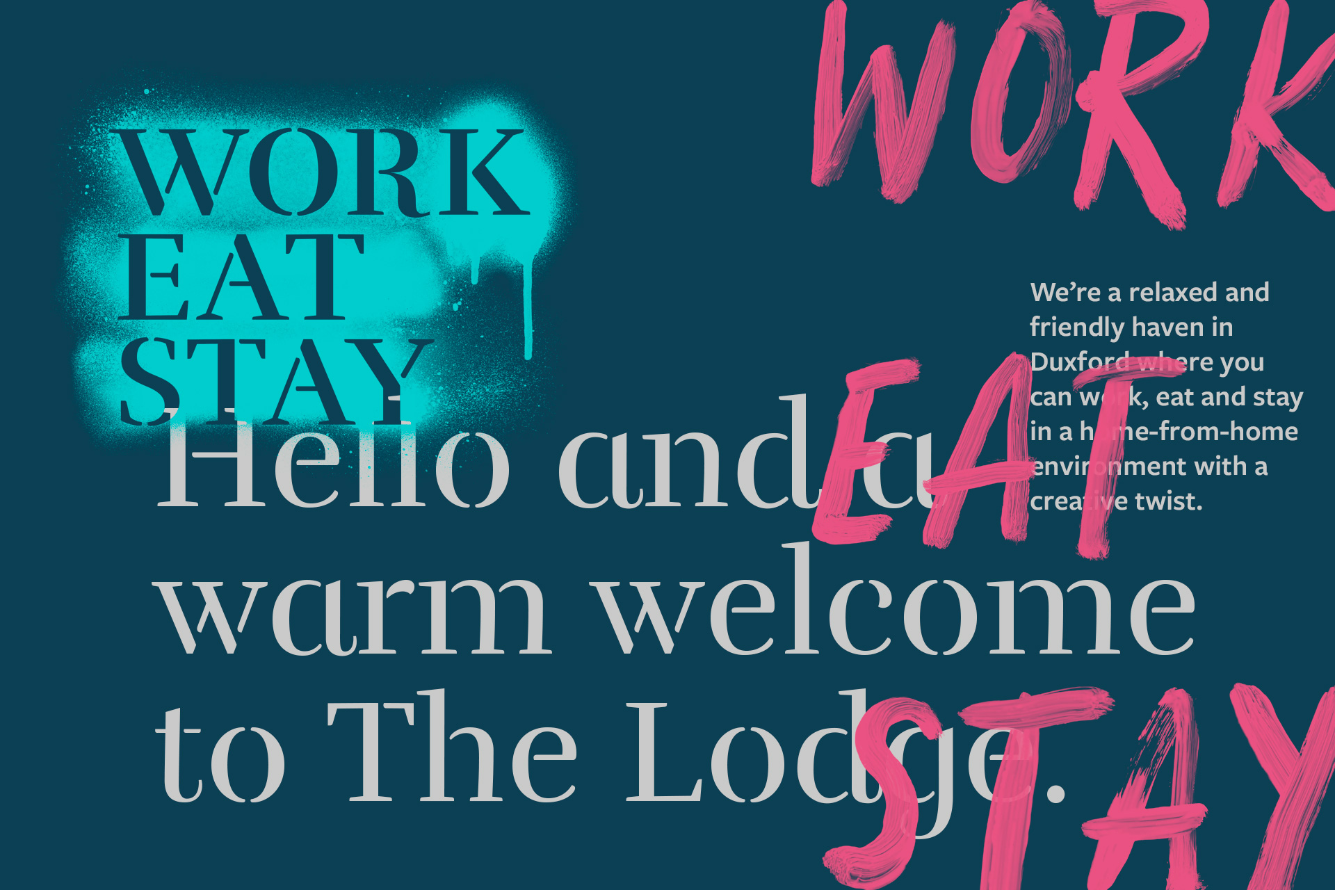
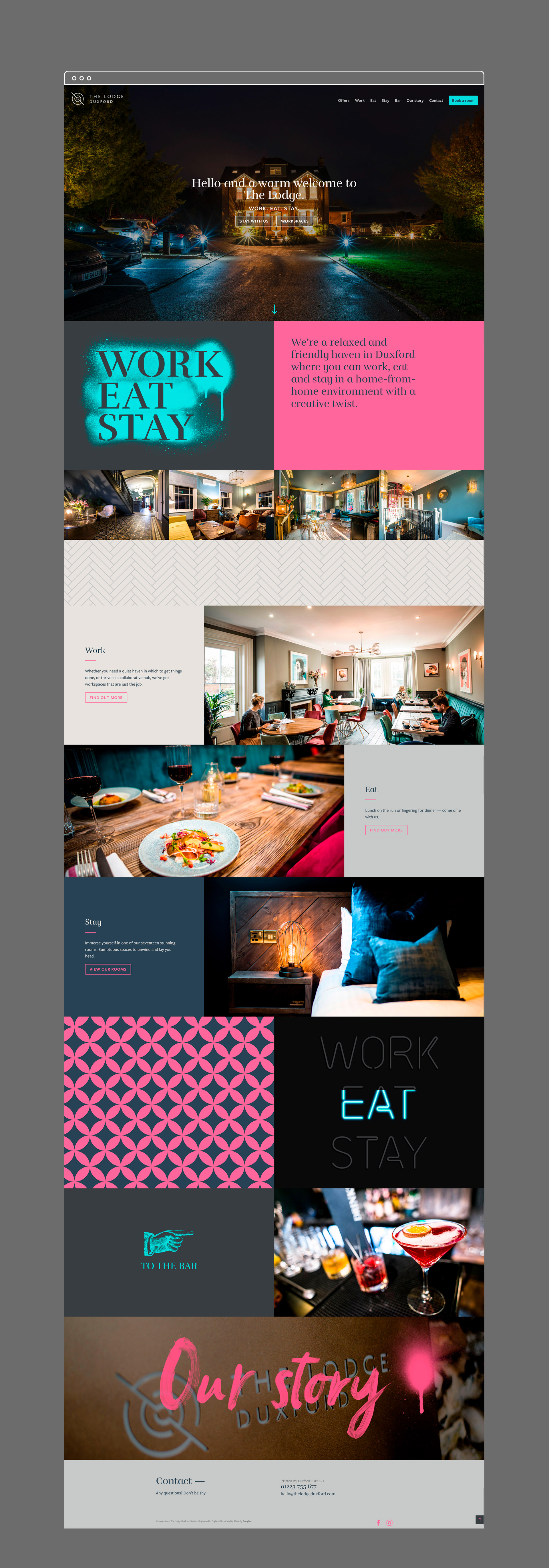

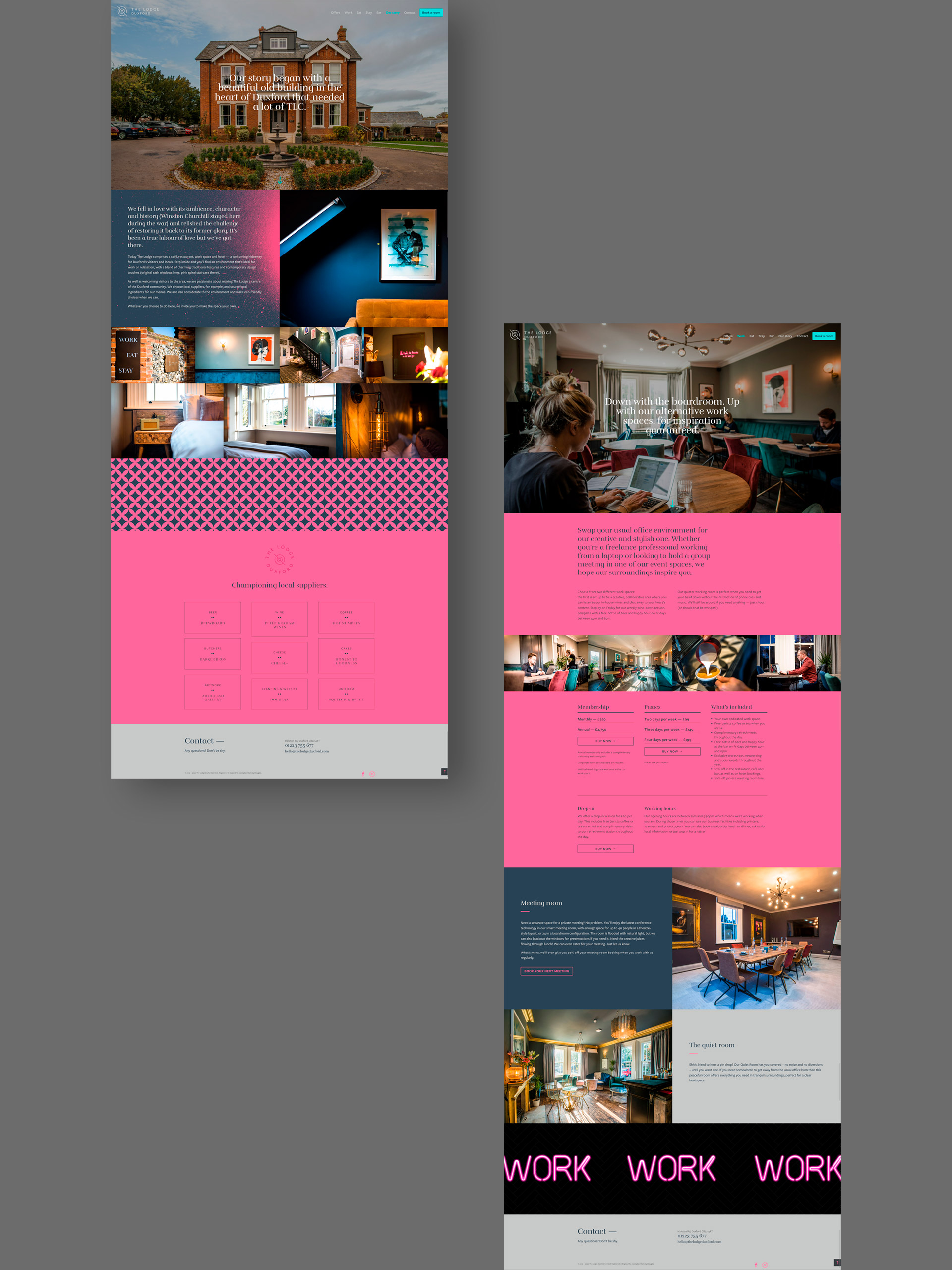
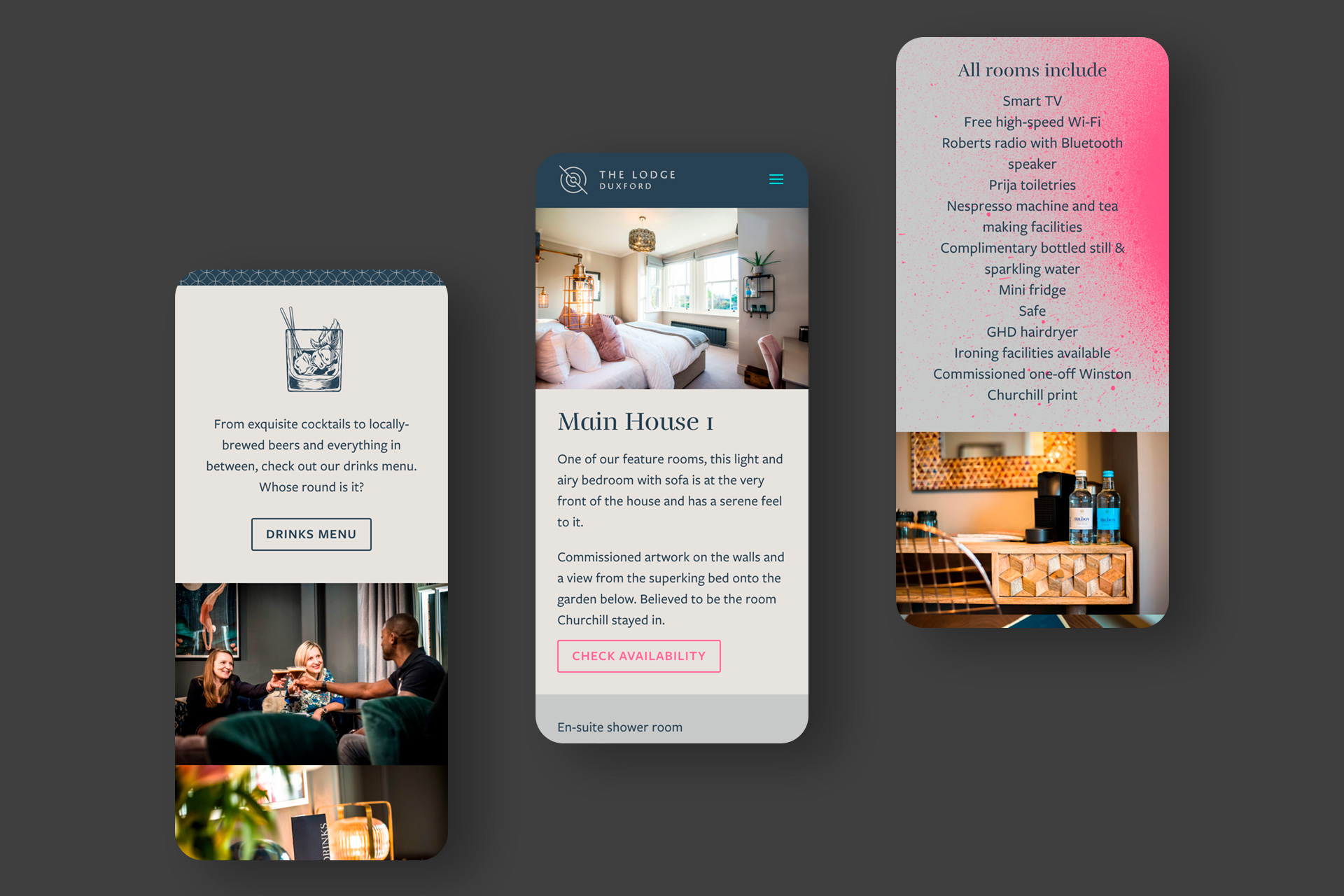
Conscious to provide as much information as a guest might ever need, our site for The Lodge Duxford showcases not only its beautiful facade, but all its delights contained within. From the co-working spaces, to the bar and restaurant, and finally the exquisite rooms, we’ve given great care and attention to the heart and soul of the building. Individual pages for each room show off their very best features, with stylish photography and descriptive copy, as well as booking functionality to make things easy for you at home.
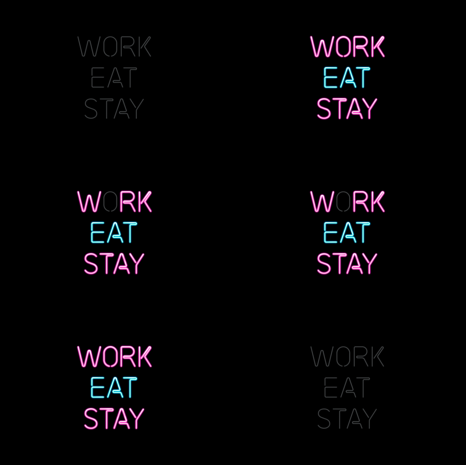
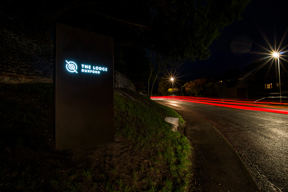
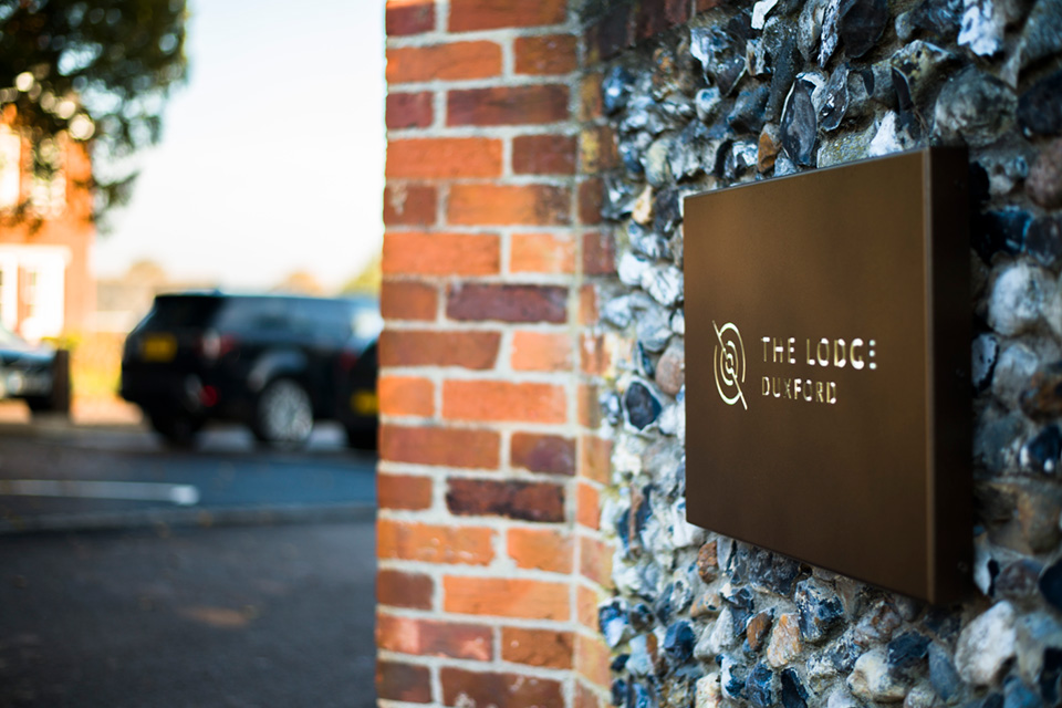
All signs point to The Lodge Duxford. Here’s some of our stunning external signage in situ – powder-coated and laser-cut with LED lighting to stand out after the sun goes down.
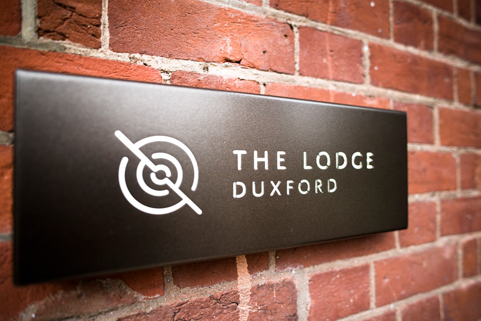
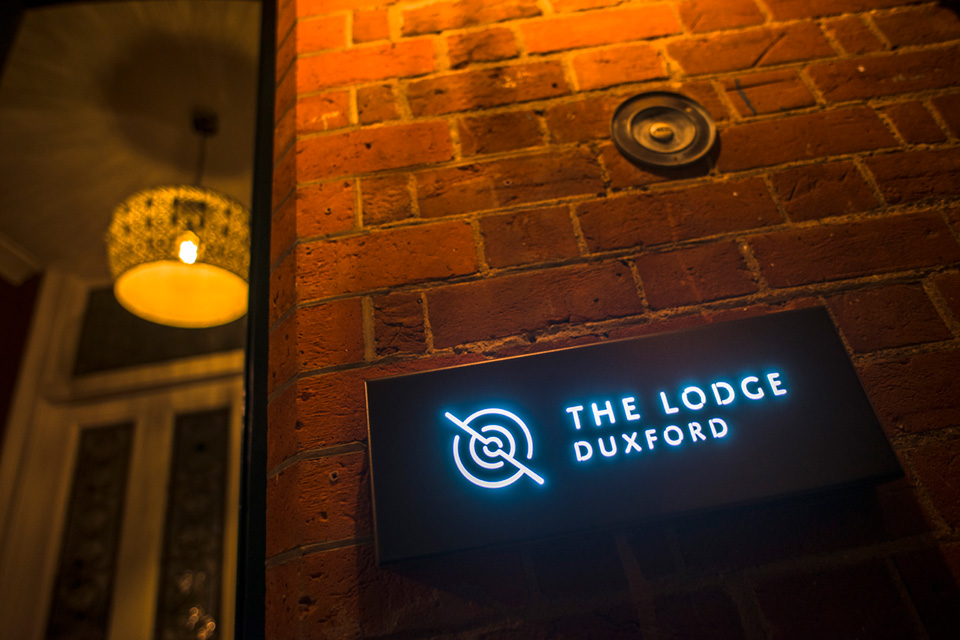
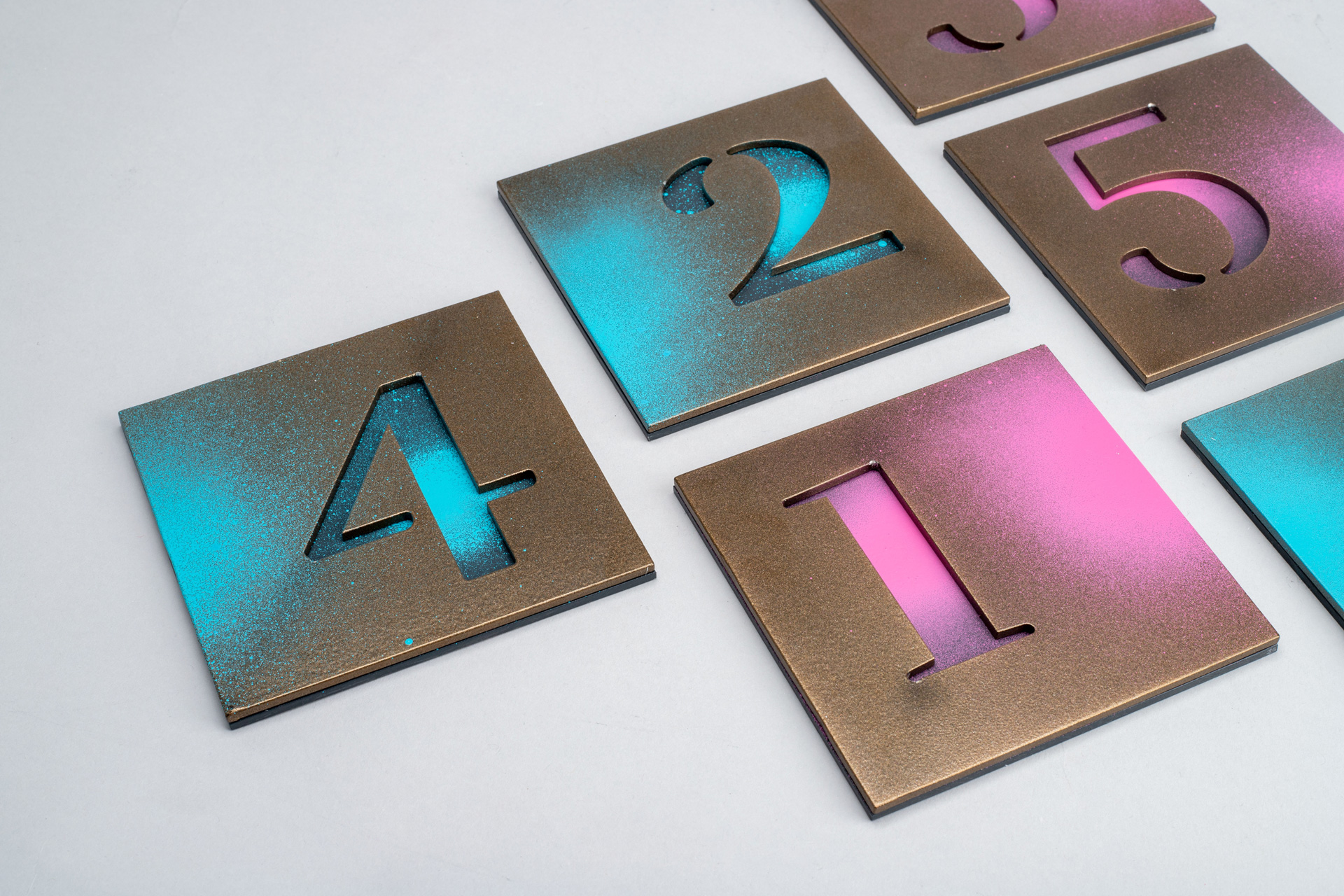
We talked about scope before. At Douglas we like to think there’s nothing we can’t do. The Lodge Duxford’s room signage is a case in point — powder-coated aluminium door numbers? Check. Laser-cut with the house font? No problem. Custom-coloured spray paint to hand-finish? We’re on it. Taking time over the small details, always.
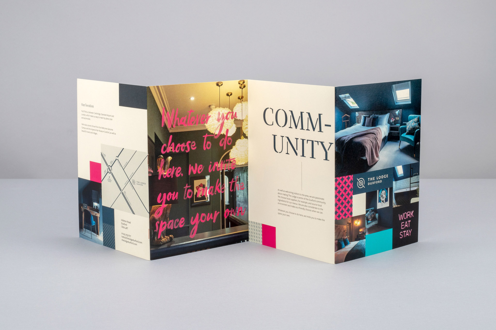
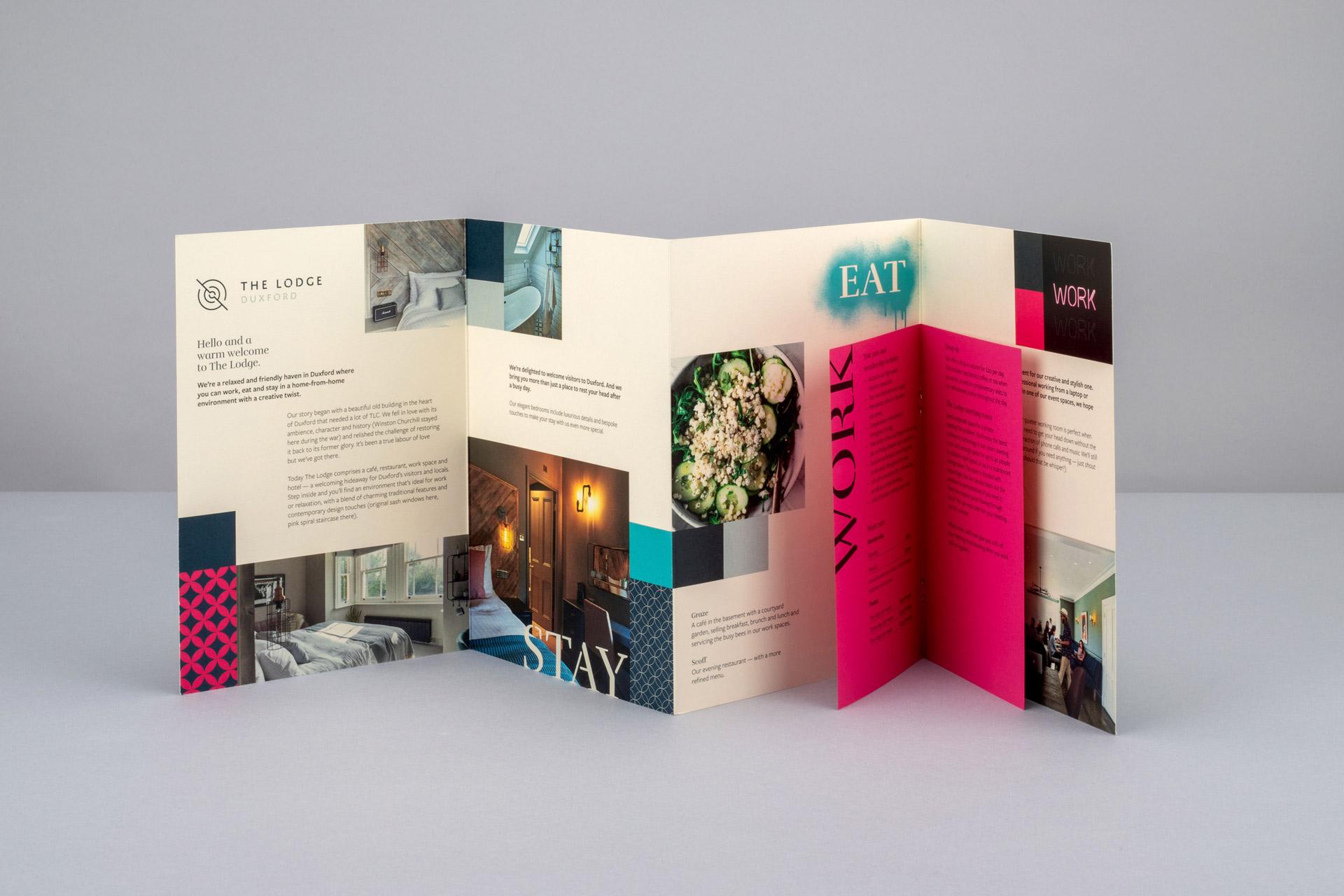
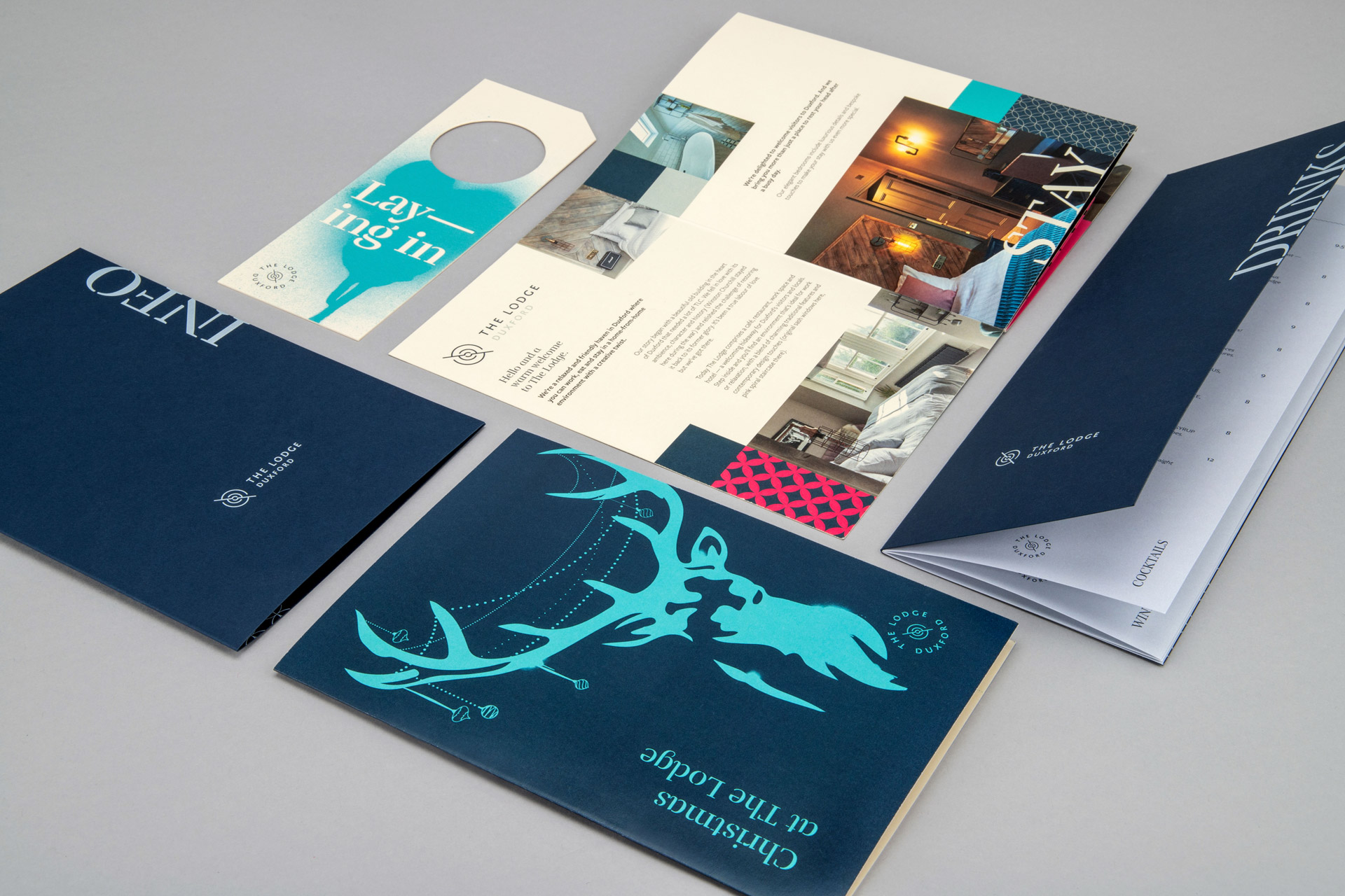
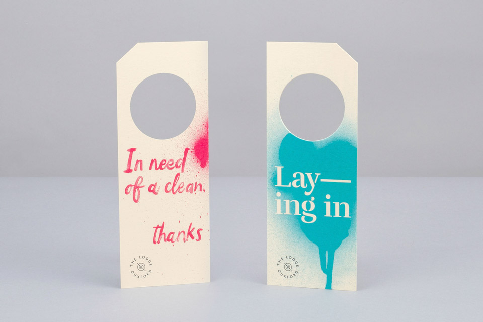
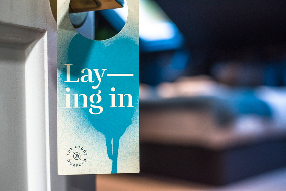
Door hangers brought to life and looking rather nice in situ. Adding a literal splash of colour and letting everyone know when you’re lying in…
